Skill Bridge
Connecting Learners With the Right Instructors


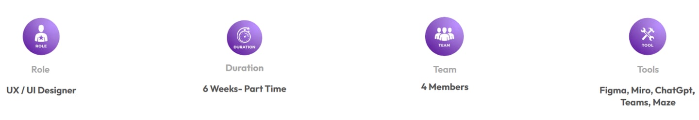
Mojgan Javan UX /UI Designer
what is Skill Bridge?

SkillBridge is a skill-sharing platform that connects students with local and online tutors for private classes across various domains such as arts, languages, and technology.
The goal of this project was to design an intuitive and trustworthy platform that simplifies tutor discovery, booking, and long-term engagement.
Project Overview
StakeHolder Needs
Learners:
Access to both online and in-person classes.
Option to join individual sessions or package courses (single or multiple sessions).
Benefit from discounts or special offers when enrolling in multiple classes.
Clear and reliable information on tutor skills and experience for better decision-making.
Tutors :
Ability to showcase their skills and experience through personal profiles.
Profiles are verified by the platform to ensure trustworthiness for learners.
Simple tools for managing classes, bookings, and direct communication with students.
Current Phase:
At this stage, stakeholders have requested our focus on tasks related to learners, aiming to enhance their learning experience.
This platform was created to address the gap between tutors who can teach various skills and learners seeking to acquire them. Many learners struggle to find qualified tutors, while tutors often lack an easy way to reach interested students. The site serves as a bridge, enabling direct and seamless interaction between tutors and learners, facilitating effective skill-sharing and learning.
Problem Statement

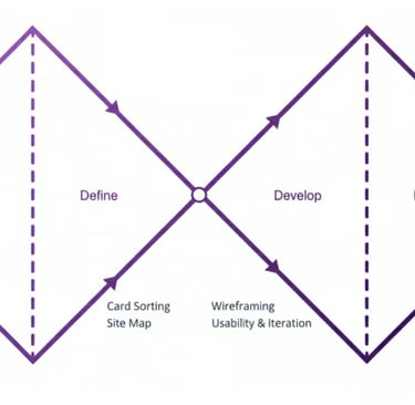
THE PROCESS
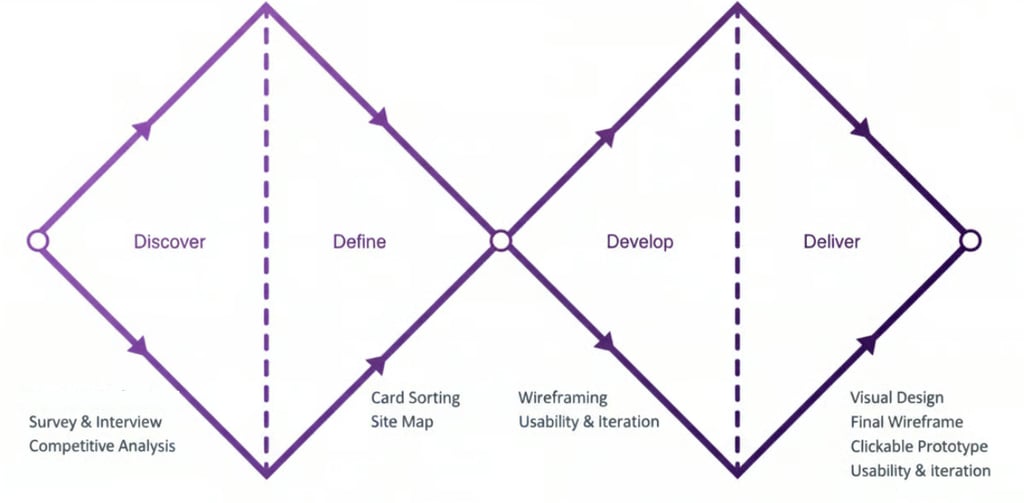
My team of 4 ran a double Diamond method based on the Design Thinking Methodology. It was not a linear path, we bounced between stages as the project progressed.
DISCOVER
DEFINE
DEVELOP
DELIVER
1
2
3
4
Double Diamond process customized for SkillBridge, from discovery to delivery.
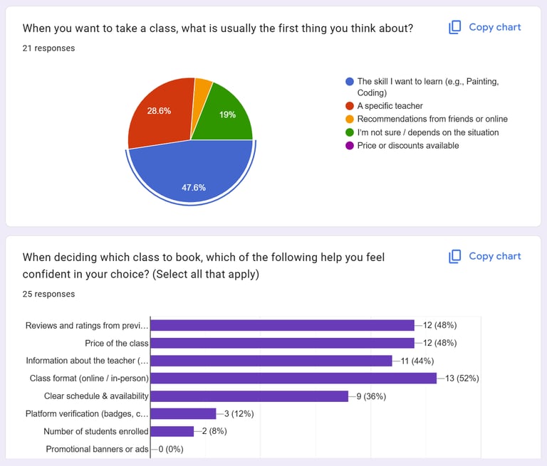
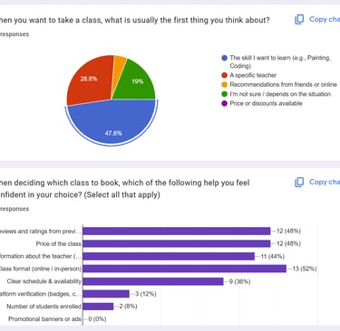
Discover
We collected 26 responses from learners who recently took online or in-person classes. Our aim was to uncover how they discover classes, what challenges they face, and what factors build trust and confidence.
Key Takeaways:
Users search for skills first, not tutors.
To decide efficiently, they need key information upfront: price, level, format, rating.
Based on these survey results, we invited 6 interested participants for in-depth interviews to gather qualitative insights for design decisions.
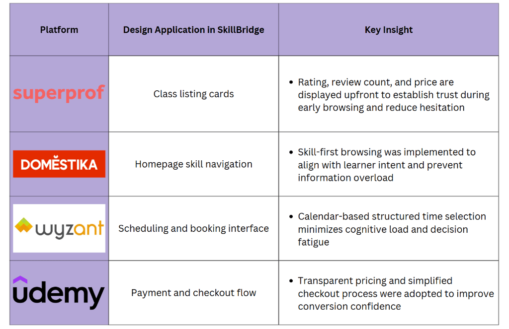
Competitive Analysis
The Second step in our research involved identifying successful patterns in current products and missing gaps. We explored different products and narrowed them down to four top competitors: Superprof, Domestika, Wyzant, and Udemy. As a team, we analyzed the good and the bad of each competitor and determined how they present their features.
We conducted our research in two phases:
Phase 1: Survey and Interview (Affinity Diagram)
Phase 2: Competitive Analysis
Survey and Interview
Interview and Affinity Diagram
Based on our interviews and survey responses, we organized qualitative insights using affinity Diagram .This method helped us cluster similar observations, identify patterns, and translate them into actionable design decisions.
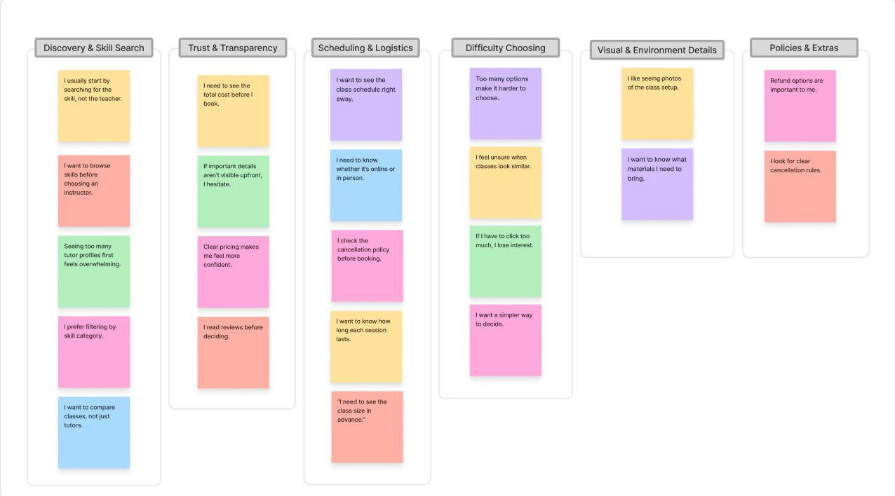
Clusters & Takeaways:
Discovery & Skill Search:
Learners focus on skills, not instructors. By prioritizing skill categories on the homepage, we guide users to find relevant classes quickly without feeling overwhelmed.Trust & Transparency:
Users need clear, upfront information (price, ratings, format) to make confident decisions. Surfacing these details on course cards reduces friction and builds trust.Scheduling & Booking:
Confusing date/time layouts cause hesitation. Clear visual mapping of schedules simplifies booking and reduces decision fatigue.Difficulty Choosing:
Too many unclear options lead to drop-offs. A simplified flow, inspired by e-commerce patterns, helps users focus and complete their booking efficiently.
Takeaway
Platforms like Udemy and Domestika make discovery easy but lack local, one-to-one teaching.
Tutoring platforms such as Wyzant or Superprof are powerful, yet often feel complex and expensive for casual learners.
Trust signals (reviews, badges, verified profiles) strongly influence decision-making.
Define
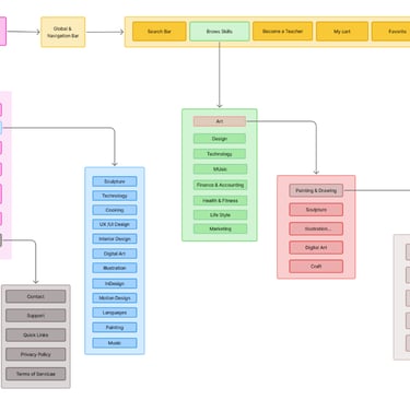
Site Map
User Scenario
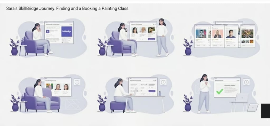
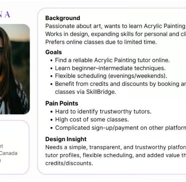
Sara discovers SkillBridge while searching for painting classes. She wants to quickly see what’s available, compare a few tutors, check schedules against her evenings, and book without worrying about hidden costs or complicated steps.
The experience must guide her through a calm, predictable flow where each step makes the next decision easier instead of harder.
Structuring the Experience
We structured the platform around one main journey: from discovering a skill to booking a class with confidence. This kept the information architecture focused and reduced decision fatigue.
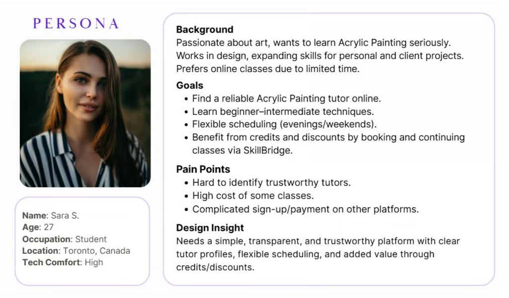
Persona
In order to establish tasks for our design, and to communicate information about the users that we collected during research, we developed a persona and a scenario.
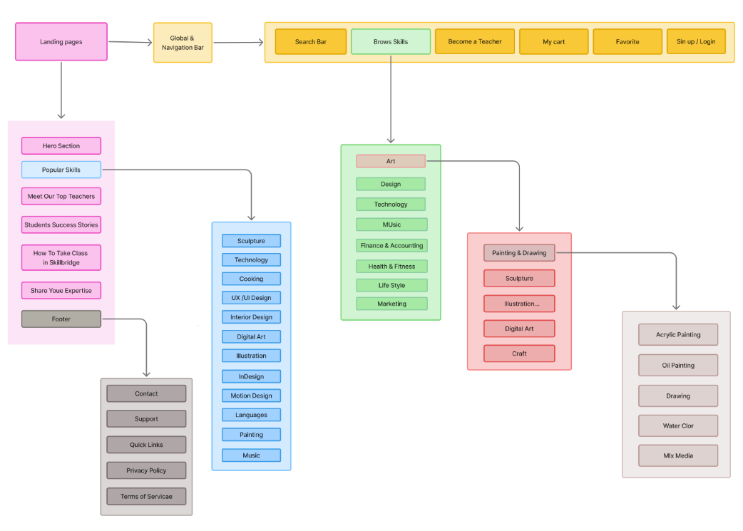
How did we design the information architecture?
Based on the results of the competitive analysis and card sorting, we developed the site map. We added a profile and shopping cart icon to the global bar.
Develop
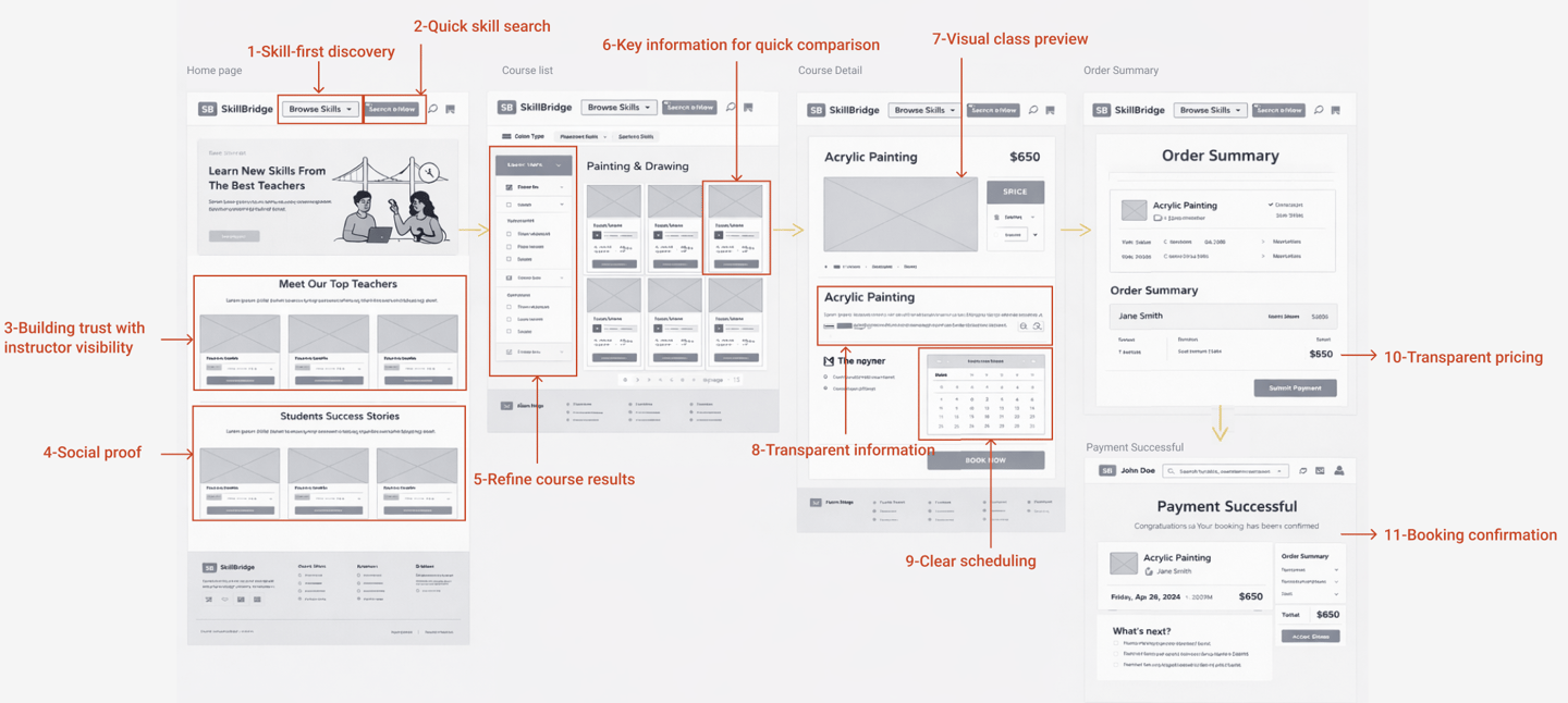
Mid-Fidelity Wireframes
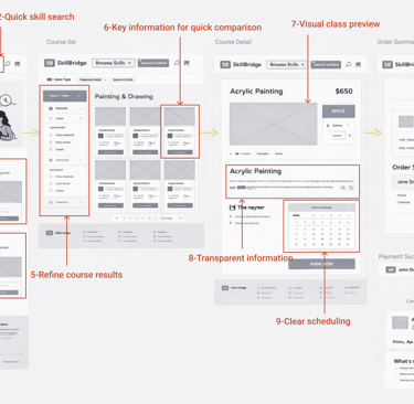
Early Mid-fidelity sketches allowed us to quickly explore layouts for skill discovery, tutor profiles, and booking steps. We tested different positions for filters and calls-to-action, focusing on reducing visual noise.
Mid-fidelity wireframes helped align the team on hierarchy and content structure before investing in detailed UI.
Deliver
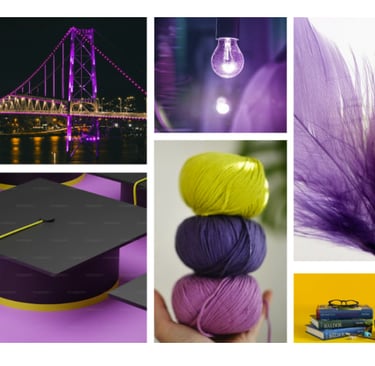
Moodboard
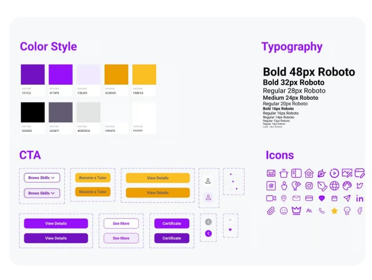
Visually, we wanted SkillBridge to feel energetic and optimistic while staying calm enough for learners of all ages. Purple became our main brand color to represent creativity, paired with warm accents and soft neutrals.

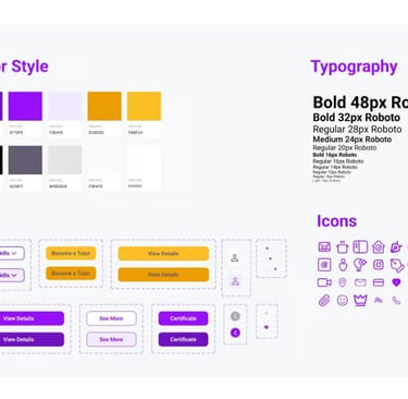
UI Kit
We built a UI system to keep the product consistent and scalable: typography styles, color tokens, buttons, cards, and iconography.
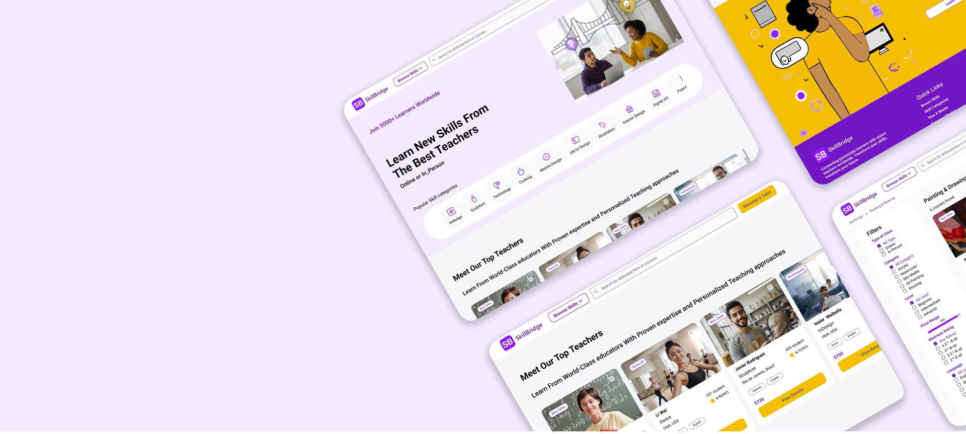
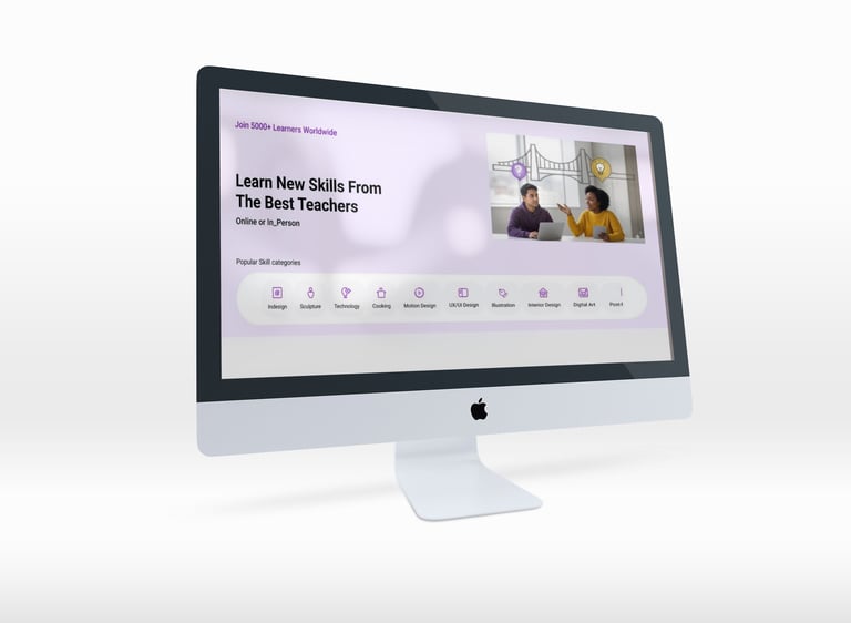
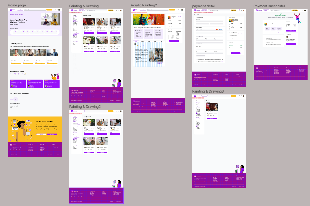
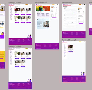
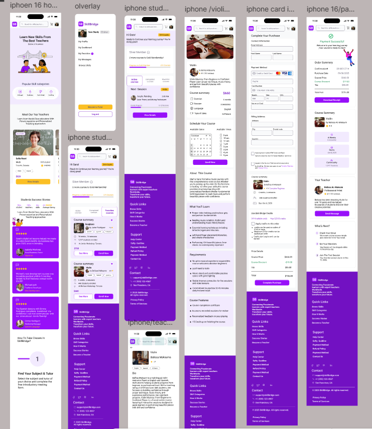
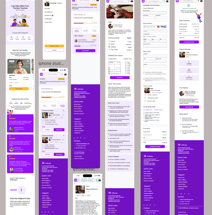
High Fidelity Mockups
After validating the flows, we moved into high-fidelity design and refined the details of each core screen: homepage, search, tutor profile, booking, and payment confirmation—across both desktop and mobile.
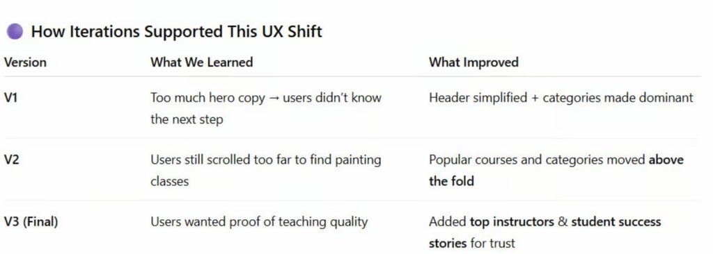
Usability & Itration
In the updated version, we improved comprehension and flow by connecting interactions:
When a user selects a date :
➡ All matching weekday slots are highlighted in the calendar
➡ The paired available class times are immediately revealed on the right
This gives users a clear mental model of availability. In the refined version after usability testing:
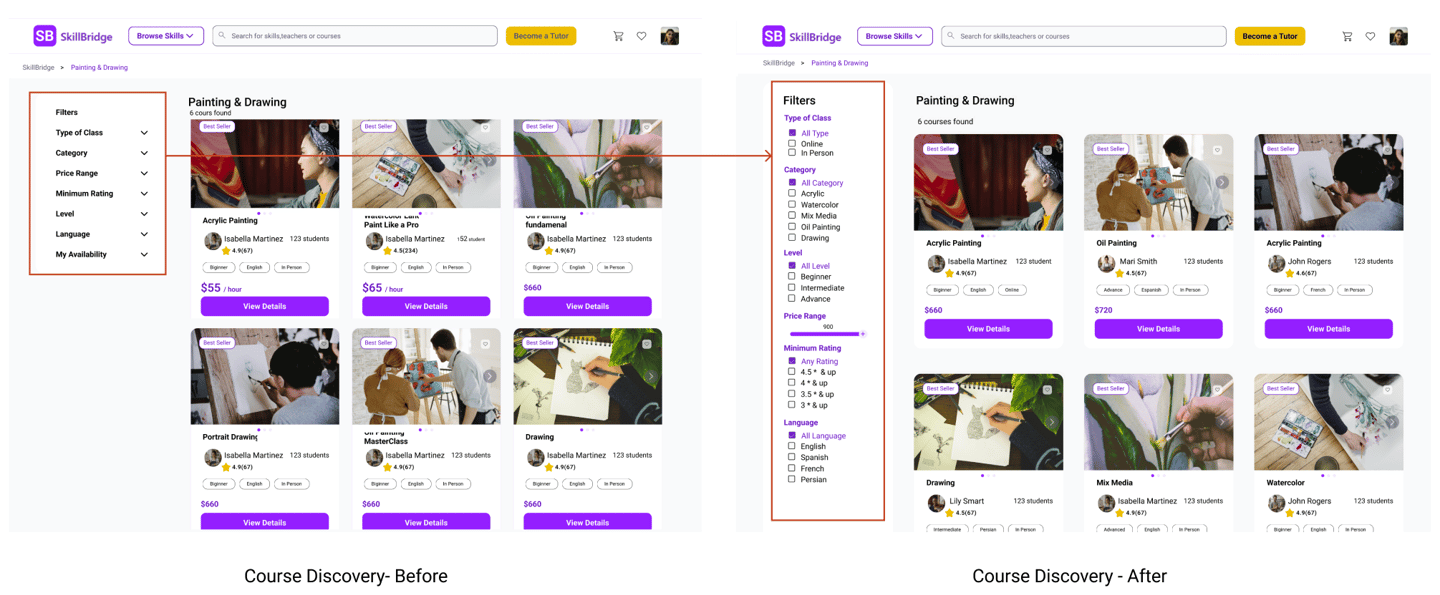
The filter column is always open and fully labeled (“Type of Class”, “Category”, “Level”, “Price Range”, “Minimum Rating”, “Language”).
Checkboxes and the price slider are immediately visible, so users understand at a glance how they can narrow down Acrylic Painting classes.
The title “Painting & Drawing – 6 courses found” gives clear feedback that filters have been applied and how many results they’re affecting.
The visual gap between filters and courses is reduced, which creates a stronger connection between the left panel and the course grid.
Result: Users understood which filters were controlling the results and felt more confident exploring and comparing painting classes.
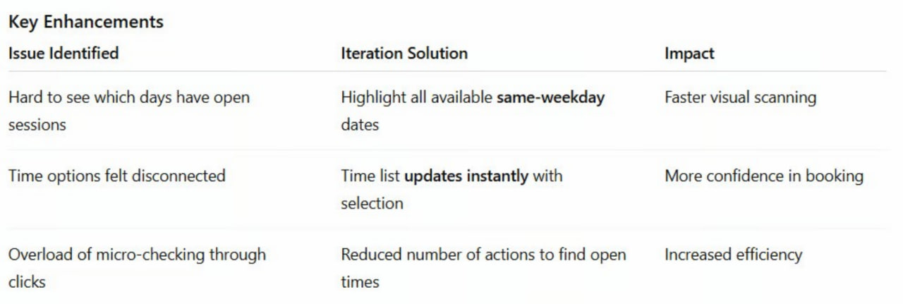
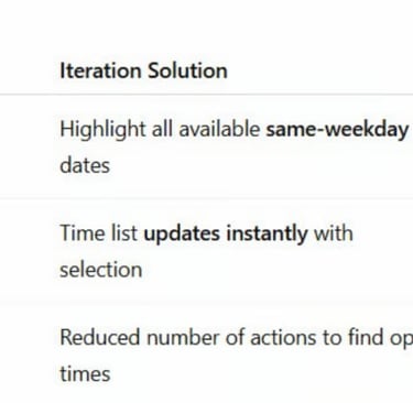
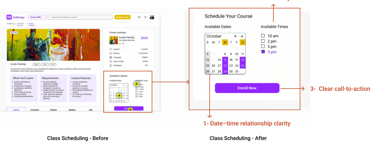
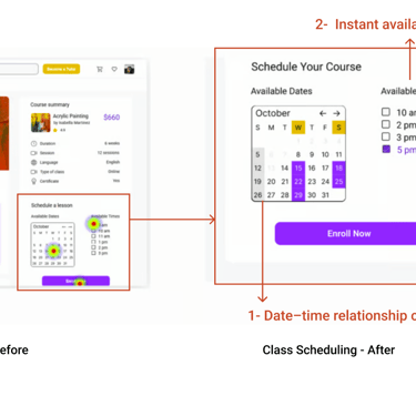
Design Improvement — Clear Visual Mapping Between Date & Time
Design Change
To support easier course discovery, we redesigned the filtering experience:
• The filter panel is now always visible on the left side of the results page
• Filters such as class type, level, price range, rating, and language are clearly labeled
• A visible result count (e.g., “Painting & Drawing – 6 courses found”) provides instant feedback when filters are applied
Result
These improvements make it easier for users to refine search results, compare relevant classes, and confidently choose a course.
3. Clear Date–Time Matching During Scheduling
Insight
During usability testing, some users struggled to understand which available times corresponded to the selected date.
In the initial design, the calendar and time slots were not clearly connected, which caused hesitation when scheduling a class.
This is your heading
You can write here as much as you want, this text will always look nice, whether you write longer paragraphs or just a few words. Click here and try it out.
2- Focus on Course Discovery
Users needed to compare classes first, and only then look into tutor details if necessary.
What changed
→ Course cards now surface the key decision info:
• Skill type (Acrylic Painting)
• Session format (Online / In-Person)
• Price
• Reviews
→ Tutor details are moved inside the course as supporting information.
First Task ResultUpdated Version
The final concept for SkillBridge enables users to quickly discover and book the right Acrylic Painting class through clear skill categories, easy course comparison, and a simplified checkout experience. Learners can explore a variety of creative courses, review class details with confidence, and add sessions to their cart with a familiar, friction-free purchase flow.
Key Takeaways — What We Learned
• Prioritizing skill categories (e.g., Acrylic Painting) reduces decision friction and speeds discovery
• Class cards must highlight essential decision details: format, level, rating, and price
• Showing valuable info early improves user confidence before they invest time reading details
• A simple “Add to Cart” checkout flow feels intuitive and reduces hesitation
Key Findings & Changes
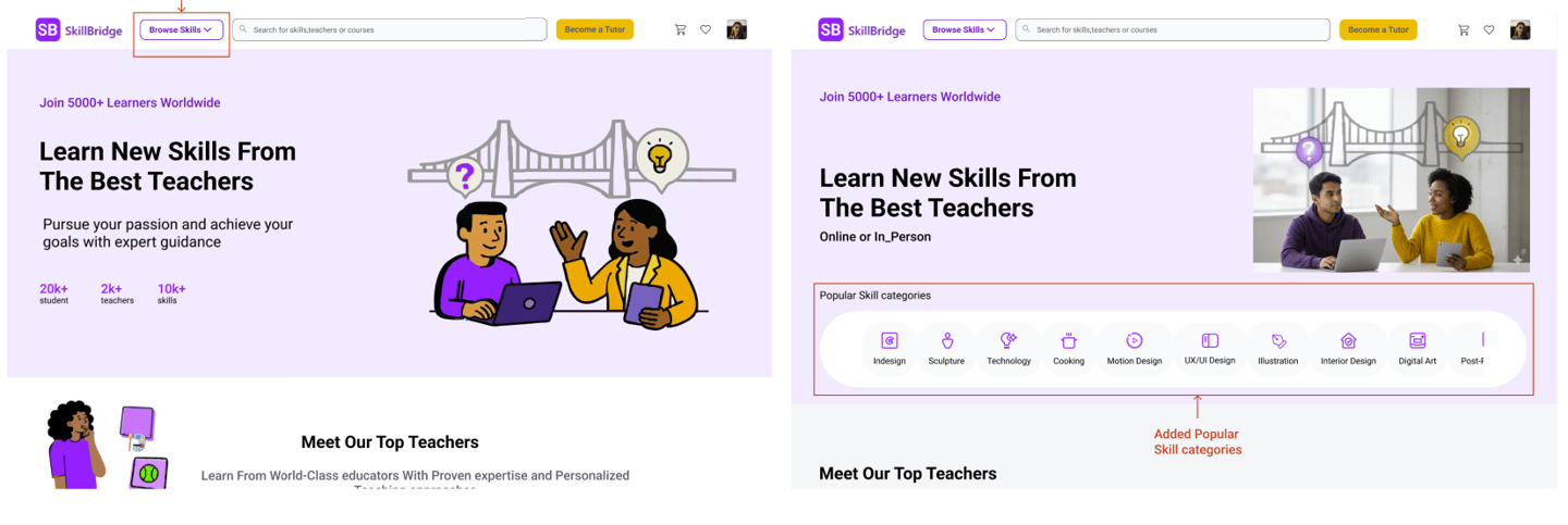
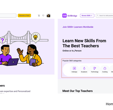
1- Learning Categories as the Primary Entry Point
Users came to SkillBridge looking for specific skills, like Acrylic Painting not tutors. They ignored tutor-focused hero content.
What changed
→ We prioritized skill categories at the top of the homepage
→ Clear visual icons + labels for faster scanning
→ One-tap entry into painting category
2. Improving Course Discovery with Clear Filters
Insight
Usability testing revealed that learners wanted to compare multiple classes before choosing a tutor.
However, in the initial design, the filter panel was hidden inside dropdown sections. As a result, some participants overlooked the filters and focused only on the course cards, making it harder to narrow down results.
Design Change
To make scheduling clearer and more intuitive, we improved the visual connection between dates and time slots:
• Selecting a date highlights the corresponding weekday in the calendar
• Available time slots appear instantly next to the selected date
• The layout visually connects date selection and available times
Result
This improvement helps users quickly understand availability, reduces confusion during scheduling, and supports a smoother booking experience.
Final Prototype
The final design provides a streamlined experience that helps learners quickly discover skill-based classes, compare options, and confidently book a session.
By prioritizing skill-first discovery, clear course information, and simplified scheduling, the platform supports faster decision-making and a smoother booking journey.
The final experience follows a streamlined path:
Discover Skill → Select Category → Filter Results
Compare Tutors → View Class Details
Choose Time → Checkout → Confirmation
This e-commerce-inspired structure reduced cognitive load and made the process feel familiar and trustworthy.
Final Prototype
Reflection
What I Learned?
This project reinforced the importance of translating research insights into clear interface structures. Through usability testing and iteration, we discovered how small design adjustments—such as improving filters or clarifying scheduling interactions—can significantly impact user confidence and decision-making.
The experience also highlighted the value of designing for simplicity when users are navigating complex choices.
Next Steps
While this project focused on improving the learner experience, the next step would be to explore the teacher-side experience of the platform.
Future work could include designing tools that help instructors create profiles, manage their classes, schedule sessions, and communicate with students more efficiently.
Read more of my case studies


Saving Faces Skin Care
Redesign Website A clinic